

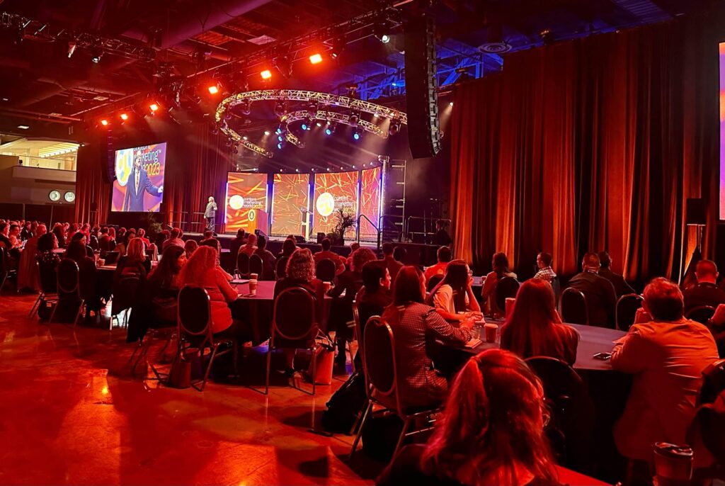
Welcome back to AIMCLEAR‘s coverage of #SESNY 2013! Yesterday’s keynote with Mike Proloux set quite a fascinating tone for much of the content shared here at this year’s New York conference event, namely: the increased use of multiple devices and social media‘s impact on the experience in a big-picture sense. This theme continued throughout Day 1 and into Day 2, with a super-informative session on Next Generation Site Architecture.
Moderator Chris Boggs, SES Advisory Board; CMO, Internet Marketing Ninjas led panelists Patrick Branigan, Art Director/ Lead Designer, Overit and Bryson Meunier, Director, Content Solutions, Resolution Media, as each took turns sharing a boatload of best practices, case studies, and insider advice for creating a comprehensive online experience for your users, no matter where they are or what device they’re using. Read on for the full write-up.
Chris welcomed the audience and introduced the speakers, revving us up for what was sure to be a session brimming with actionable tactics and sage advice. The goal? To help us make sure our sites are ready to deal with the added problems and benefits associated with multiple devices, social media, real-time, and user-generated content. Let’s jump into it.
Patrick was up first. “When we’re thinking about the next generation of site architecture,” he began, “it’s important to start by grasping what architecture exactly is.” Fair enough. Here’s three main definitions of “architecture,” each one different from the last:
Architecture is…
- The art and science of designing and erecting physical structures
- The activity of designing a system
- An approach to planning, designing, and developing a website presence
This presence of course includes those valuable things like sitemaps, wireframes, prototypes, and so on – but the digital realm is so fast moving, it’s becoming an extension of our daily routine. It’s showing us what architecture is no longer going to be.
Site Architecture is NOT:
- A list of pages
- Static information
- Defined by one person
- Simply telling a story
So… what is it? What’s it all about? Let’s define the constant that threads between those three definitions above. Building houses, building systems, building websites… what’s the common theme? The constant is, in fact, people. Users. People are the most important aspect regarding next gen architecture.
Thinking About People
According to Patrick, next gen website architecture is an approach to creating an online ecosystem that can be driven and evolved by its users.
The three elements to consider (the three elements that drive engagement) are:
- Social Media
- Content
- Accessibility
Let’s unpack each of these elements.
1. Social Media
Social media is fueled by conversations as a whole. Driving factors include sharing and commenting- these functionalities are all about people and human engagement. People enjoy conversations because they’re instant, spontaneous, and ongoing.
Social Media, or the social aspect of sites, is traditionally represented by elements such as chicklets—or the social icons that reside at the side, top or bottom of a page. Chicklets are easy to recognize and universally known because they’re basically little mini boxes with logos of the social media channels they represent. People know exactly what action they will be performing when they click on one.
Brilliant, right? Hmmm. We’re not so sure. Patrick asks, “Are these elements actually prone for a human conversation? Are they seamlessly allowing for a conversation to happen? Or are they disconnecting the user from the conversation?”
Chicklets and similar social share buttons can be fabulously useful provided you take into consideration three essential components, which speak to aesthetic site architecture:
- Placement: Are you strategically placing social elements to enforce users to converse at the right time?
- Function: Is the functionality there? Are people having a conversation with one another? Or are they having a conversation with the system?
- Organization: Human tend to gravitate towards organized categories – is there a rhyme and a reason to your social aspect?
Overall, your focus should be on further naturalizing the conversation experience for your users.
Restructuring the Social Aspect: The New York Times
Patrick showed a screencap of a NYT article, with a “comment” button on the top left of the article, and share buttons along the left side of the page. These two social arenas aren’t talking to each other L What’s to be done?
Take the avenues and put them into one anchored piece of real estate on the view post!
A new screencap shows an organized mounted grouping of the comment and share buttons so that when users are engaging with the content, they have the ability to talk to one another and talk back to (engage with) the content, without having to be redirected to a different page. This new cluster is repositioned on the top of the view page, so there’s no need for scrolling to the bottom to comment on the content. It’s organized in a way so that the media platforms such as Facebook and Twitter and whatnot are being converged into one universal motion – the share motion.
In real life, there’s a cycle of conversation, taking in information, and deciding if we want to tell other people. This restructuring is all de-cluttering the pathways and universal format to allow for instantaneous action—a crucial element consuming and conversing with content and with users.
Social Aspect Takeaways:
- Encourage users to interact and engage with your content via placement organization and function of elements.
- You’ll see an increase in:
- URL sharing
- User views and impulse views
- Higher probability of viral impact
- More sharing means better rankings and higher CTRs
- The architecture the user is going to engage in is as important as the actual linking and sharing. One encourages the other.
2. Content!
Without rich and highly engaging content, no one will really care.This is being made clear by Google through things such as author rank. Credibility is important – this also comes back to people, in this case, the people providing the content (it’s less about how the content is being shared and linked to different pages).
Authorship, Credibility, & Why It Rocks
Authorship is about connecting a website writer’s account with his or her Google+ account. This creates rich SERPs with an author’s avatar and even byline next to his or her articles– gorgeous increased piece of real estate!
Why is this so valuable? Authorship suggests credibility. People like other credible people. As a user, as a human, you trust that which has more human characteristics. The emphasis is not only what’s on the page, but who provided it. It’s about adding a personality to the result, allowing for a suggested higher CTR, higher ranking, implying there’s trust here.
To set up authorship: (1) Link your content to your Google profile and (2) Link from your Google profile to your content.
Relevance & Credibility
Markham Nolan gave a fascinating TED talk entitled: “How to Separate Fact and Fiction Online.” In it, he discussed the concept of pulling quality from quantity – the evolution from the pursuit of finding facts to the act of verifying them. Twitter is fast becoming a journalists’ best friend- why? The information delivered by Twitter is instant (and massive!), and if you’re following along with verified accounts, the assessment of credibility is pretty much instant as well. Et voila: pulling quality from quantity.
Google is realizing this significant concept. In order to increase engagement and prioritize content in SERPs, Mike noted search engines need to rely just as much on thought leadership as much as they do on their own algorithms.
Other Content Considerations
- Text. Text is obviously important, especially from a design perspective. If you don’t use webfonts you’re doing it wrong. Check out Google Webfonts to incorporate into your page. This way, all of your text can be crawled and it’s more engaging—a marriage of good looks and crawlability. Interesting fonts will, at the very least, gain a reaction from the user, which prompts engagement.
- To add webfonts: Add stylesheet link to call on the desired font from Google’s library of webfonts and then style with CSS>.
- Images. People love images. Optimize your imagery with alt text, keyword-rich file names, and be sure your images are sized properly. Enormous images may still resonate well on a small screen (mobile phone), but it will impact page load time, which can directly impact bounce rate (negatively).
- Videos. People also love videos! Optimize your videos with KW-rich titles and descriptions. If you’re hosting videos, be mindful of the delivery and ease of sharing. Immediately focus on how you’re delivering it, (Flash, HTML5, Silverlight?) What is your demographic using? Are analytics showing devices they use don’t support the technology you’re using to supply your videos?
Biggest Content Takeaway
- Text is still king, but all content is continuously evolving. Providing impressive content encourages engagement!
3. Accessibility.
Patrick “jokes” about responsive web design (RWD) as being the #1 buzzword of 2012. He stressed that it’s not the easiest, only, or even best solution out there when it comes to multi-device usage and user experience.
Of course, there are benefits: Increased accessibility, single URL, no redirection, reduced load time, easier sharing experience, saving resources for the site and crawlers, and so on.
So… RWD isn’t for every site. How can you know if it’s the best solution for yours? Start by asking yourself these questions (and notice how they’re all about people, i.e. your audience!)
- What % of our site traffic is mobile? Experts suggest if it’s 5% or more, consider RWD. Patrick suggests 4% or more.
- Does your current mobile % translate well to other sites? Â
- How do your bounce rates compare? If they’re not relatively similar, consider RWD.
- Are you forgetting your purpose? It’s about the people! People general want specific content depending upon their situation and device. “Cut down on the content!” isn’t a smart conclusion. Instead, focus on diminishing elements that don’t accentuate the ability for your user to achieve the goal you want your user to achieve.
20,000 Foot Sum-Up
The three components to site architecture:
- Social Media – Conversations drive engagement.
- Content – Build creative, personable content – people like credible, relevant content– if it’s credible and relevant, users will help you be found.
- Accessibility – You must remember that the way in which you provide content is just as important as the content you’re providing.
Final thoughts: It’s about people as much as it’s about robots!
Bryson was up next, set to focus exclusively on RWD and other solutions for multiple devices.
Site Architecture, Then & Now
In the 90s,when a website wasn’t working or was being revamped in some way, we used to see those flashy “Under Construction!” signs plastered on pages. Back then, there was less emphasis on being optimized so much as being functional. As far as webmasters were concerned, there was only one type of user: a dude sitting at a desk.
Nowadays, site architecture is much more involved, namely because we have users accessing websites on all sorts of devices from all types of locations (on the go, at home, at the office, in a coffee shop, and so on). It’s hard to tell who your user is, so you have to prepare to accommodate as many types of users and devices as possible.
Multiscreen Usage & The Rise of Mobile
It’s coming! Google says it’s here. Today. Right now. Yep. Here are some fascinating stats:
- 90% of all media interaction has to do with a screen
- 38% of media interaction happens on smartphones (don’t design just for smartphones, design for feature phones, too)
- 90% of consumers move between multiple devices to accomplish their goals
- According to RKG, 25% of Google searches are mobile.
- Since 2008, mobile searches doubled every year to the point where it’s surpassing desktops in some locations (like India).
- Mobile search will be bigger than desktop in the near future! It’s not a matter of if, it’s a matter of when.
“Mobile search is definitely going to surpass desktop search. The lines will pass, and I think they’ll pass before anyone thought they would.” –Scott Huffman, 2011.
Kelsey Group suggests Mobile search will be bigger than desktop in 2015. That’s less than 2 years from now! They’re theorizing mobile usage will increase from roughly 25% to 50% in less than two years. Sheesh.
That’s the reason to make your site accessible to mobile users today.
Here’s how:
3 Options for Mobile Configuration (Per Google)
- RWD: Same HTML and URLs, different layout.
- Dynamic Serving: Same URLs, potentially different HTML through device detection.
- Dedicated Mobile Sites (MDOT): Different URLs, different HTML.
Regarding popular wisdom about mobile configuration now… like Patrick, Bryson doesn’t agree that RWD is the best solution. “But Google says it’s the best!” RWD enthusiasts claim. Does it?
According to Google, RWD is preferred if and only if it’s the right solution for your users. If it’s not, they don’t prefer it (clearly). Overall, Google’s stance on mobile URLs and dynamic serving is that the power is in the hands of the webmaster, i.e. it’s not up to Google to decide what’s best you’re your users as far as mobile is concerned. It’s up to you.
So, is RWD best for your users? How can you decide? Also like Patrick, Bryson offered up some helpful questions you should ask yourself when making this decision:
1. Are mobile users well-served by the current information architecture (IA)?  To help illustrate this concept, Bryson categorized KWs for Starbucks’ site (which uses RWD) based on how they label them on their site – then he took the search volume for each category and assigned a priority based on mobile, desktop, and all users. He then looked at prominence for each category on the site (top left = 1, below fold = 20, for example). This was a useful exercise to show what users are looking for and whether or not that matches up to how visible that content is made on the site.
In this case, what Starbucks is presenting on its RWD site is not what people are looking for! Prominence of “find a store” – a high mobile query – was ranked at a 2, but it should be a 1. “Starbucks careers,” ranked at 21, but it should be 3. There are even categories totally missing – maybe for business reasons, but they’re absent from the navigation, such as: “holiday hours,” “prices,” and so on – things people are concerned about just aren’t there! If you have a site that has IA issues (doesn’t have the content people are looking for), RWD won’t make the categories magically appear. If you want to make your site better fort SEO, fix the IA… then worry about RWD.
2. Are mobile users using the same KWs as desktop users? Yes, your users on mobile are the same users on desktops, but they’re in a different context. Mobile users are more likely to use common, short-tail words – and often, their searches have more to do with location and an emphasis on “right here, right now,” than perhaps desktop searches. Bryson shared another thought-provoking example of Disney, which has a RWD site that was actually selected as among the top 25 best of 2012 by .Net magazine. One of the top KW queries for that mobile site, however, was something Disney wasn’t even offering: mobile games. Not offering what people want means Disney is missing out on a boatload of traffic and conversions. Owwie.
Here are some other top mobile KW queries for assorted industries… do you belong to one? Are you optimizing your mobile site for these mega KWs?
- Finance: 99% of volume for KW “ATM locations” comes from mobile devices. You better be optimizing for that!
- Food services. 97% of searches for “bars” comes from mobile, and 80% for “restaurants near me” come from mobile.
- Apps: 69% of “apps for andriod” come from mobile and 73% of “download ringtones” come from mobile.
These are all high intent KWs indicating the on-the-go user is ready to do something… right now!
3. Will mobile-only features also be helpful for others users? We can incorporate them into the mobile web through HTML 5, but can also get link equity as a result? People are engaged with apps a lot more than they are on the web. Bryson suggests making engaging content for the web so we can get more people spending time there, rather than in separate apps. We need to make mobile web experiences engaging. There’s a lot we can do thanks to HTML5, e.g. connect to camera, and other features native to the page, eliminating the need for an app.
Funnily enough, while Google recommends RWD, it develops for mobile, desktop, and tablet separately. In other words, consider creating content exclusively for certain kinds of devices, as it makes sense. Google’s app GoogleNow, for example, doesn’t make a whole lot of sense / offer a whole lot of value to desktop users, but is very useful for mobile users, thus it is designed for the smartphone. They’re providing a good by creating useful content for specific devices (even if they’re not following their own advice, namely: use RWD, i.e. map all of your desktop site content to mobile).
4. Does my audience primarily use smartphones? You may think the answer is, “Duh, everyone has a smartphone,” but consider the 158 million visitors and 98 billion pageviews from feature phone users in Opera (in the month of December, 2012 alone!). Are you really willing to say to 10% of the mobile population that you’re not interested in their traffic and you don’t care about their user experience?
5. Is speed important to conversions? An impressive 66% of users find mobile sites through a search engine… but if they don’t like what they find, 79% of mobile searchers say they are 5x more likely to abandon the task than desktop users.
“You can’t escape this fact. A responsive website turned to performed the best it can would not be as fast as a dedicated MDOT site tuned equally well. Or more realistically, an average responsive website would always be slower than an average MDOT site.” – Guy Podjarny
At the end of the day…
RWD is no silver bullet for SEO success. That’s the point of these 5 questions. Assess them in the context of your business and demographic audience and make the decision from there.
What About JavaScript?
There are three approaches to implementing JavaScript Bryson explained:
- JavaScript Adaptive: URL serves the same content (HTM, CSS, JavaScript as an image) to all devices
- This is JavaScript’s favorite choice
- Combined Detection: Different HTML, via served
- Dynamically Served: Same HTML but JS is dynamically served with <script> based on user agent
Some final tips:
- Use vary HTTP header with dynamic serving –Google recommends it, some have found the user agent for vary is broken, so be aware of the dynamic serving. You may have problems.
- Use switchboard tags with mobile URLs
- Do NOT block Googlebot, mobile or otherwise! People think that because Google has basically three user agents for mobile and desktop (feature, smartphones, desktops), that you can block from the mobile bots your desktop content and vice versa. (With switchboard tags, this isn’t an issue.) Please, don’t do this. It can cause major search problems.
- Â Check out Byron’s Mobile SEO best practices for more!
Big thanks to Partrick and Bryson for their awesome advice and tactics! Stick around AIMCLEAR blog for more coverage right here from #SESNY 2013!
photo credit: Â julesmeijer on deviantart.com


