Welcome to Day 1 of #SESNY! Whether your company’s goal is to make a trillion friends or a trillion dollars, a solid SEM strategy is a serious cornerstone of success. Consider it the well-balanced breakfast of champion marketers. A healthy blend of organic, paid, contextual, and conversion optimization (plus, of course, two scoops of raisins and a strawberry toaster pastry) can help pave the way for an effective, measurable search marketing campaign. Day 1 of Search Engine Strategies New York kicked off with an array of rad panels, but for attendees hungry for super-actionable takeaways, the 6 Strategies For Superior SEM Results session was a supreme choice.
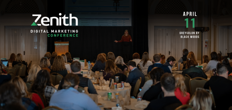
Wpromote’s Michael Mothner and Michael Stone took the stage to share client case studies and specific examples that demonstrated the 6 strategies. The #1 goal? Dish out piping hot brain-chow that can be “immediately implemented to improve the results of your online marketing efforts.” (The special bonus surprise? Gummi Hamburgers for everyone in the audience. Pretty sweet menu.) AIMCLEAR live-tweeted this session. Full coverage lives after the jump.
6 Strategies for Superior SEM Results
Michael Mothner was up first, introducing himself, his co-presenter, and their company, Wpromote. After a quick get-to-know-ya, it was time to dive into the goods. So let’s follow suit, and do the same.
#1 Always Test Everything
The first part of this step actually isn’t testing everything; it’s understanding what you should test. Understanding the elements of your site, the variables, and what can be easily changed for effective results is key.
Things to test:
- headline
- buttons
- images
- sub-headlines
- forms
Within each of these elements, there exist, like, seventeen sub-elements. For example, when you’re testing the buttons, test the color, shape, size, placement on the button… the font-type on the text of the button… the alignment of the text on the button… you get the picture. Test. EVERYTHING.
Mothner ran through some testing examples, to show how tweaking one seems-subtle element can yield ridiculously large results:
- Headline Testing. Say you’ve got a car website, and you want to test different headlines. Headline option #1: “Life is short. Just Drive.” Headline option #2:  “Drive 5 Super Cars. The US Super Car Tour.” Very different headlines. Which do you think did better? I guessed the 1st. But the second headline got more conversions… 34% more.
- Button Testing. You’ve got a gaming website. A conversion for you means downloads of your free game. Which button text do you think would get more clicks? Option #1: “Sign Up Now” or Option #2: “Instant Demo.” Well, we are a generation of instant-gratification. Option 2 had an 84% more sign ups than option #1. Yow.
- Image Testing. The headline of  your web page is “World Class Hosting.” Two options for the image next to your page text. Option #1: A padlock. Option #2. A globe. Which do you think did better? The padlock. By 200%. Two hundred percent! That’s 200% more sign ups or form submissions you wouldn’t have gotten (or even been aware of, perhaps) without this simple testing.
- Sub-Headline Testing. Think of your sub-headline as a very, very literal space to express your call-to-action. Option #1: “30 Day Free Trial on All Accounts” vs. option #2: “Sign up, takes less than 60 seconds!” Which converted higher? Option #2. By 30%. Man, oh man.
- Form Testing. This one was a little different. The objective with this testing was to identify how much info you need for a lead… name, email address, etc. These fields should be in a “required step 1” of your form. Everything else is secondary… add it to an “optional step 2” form. More likely than not, users will willingly share the follow up info with you.
- Site Testing Tools. Mothner recommended Optimizely, Google Website Optimizer, and
ADOBE Test & Target, among others.
#2 Facebook Advertising
Facebook PPC is, in some ways, pretty darn different from search PPC. Some of the major challenges Mothner pointed out referred back where the would-be clickers are.
- They’re not performing a search.
- There is no intent.
- They’re content looking at friends’ vacation pictures.
- They may not want to leave the Facebook experience.
All of these factors are, in a way, working against you as you’re trying to get a user to click on your ad. You have to accept these challenges and strive to overcome them. How? Use headlines, images, & ad copy that speak to the users, keeping in mind they’re on Facebook.
- Images of people (it’s not called Facebook for no reason)
- Headlines that speak to tightly focused segments
- If you’re targeting a very specific age group, for example, people who are exactly 23 years old, test a generic headline (“Hey, you!”) vs. a specific headline (“Hey, 23 year old!”)
- In general, the more specific the message, the better
An awesome-interesting aside: Mothner noted that he, too, has seen keywords in status updates be factors in what ads folks are served. Creepy/cool.
Test, Test, & Test Again. Then, Tweak.
Testing your Facebook ads is absolutely essential. Swap out headlines, thumbnails, creative. Track the success / failures. Tweak accordingly.
Chart your ad CTR (click through rate) on a line graph. If you don’t rotate and refresh your ads, chances are you’ll see a dramatic drop off in CTR over time (like, maybe even a few days). This is as blatant an indicator as any– you must refresh your ads.
Discovering a Happy Medium for Destination URLs
Facebook ad campaigns can have very different goals. 1) Drive traffic to FB page & gain likes. 2) Drive traffic to site & boost sales. But consider a happy medium. If your goal is sales, it’s not always easy to get people to convert on your Faceobok Page. But not everyone is ready to immediately leave their safe, cozy FB experience. Consider pointing ad-clickers to another area within Facebook– such as a tab dedicated to getting people prepared (and excited!) about moving forward to your site.
#3 Infographics
Ahhh, infographics. Great, glorious, eye-candy for the neurons. For those of you who haven’t already been seduced by their splendor, infographics are graphical visualizations of data or interesting information. Put another way, they are a creative, interesting, genuine,white hat way to garner links from other sites. Goooo, SEO! But infographics are more than just,well, great, glorious eye-candy for your neurons. They carry huge benefits. Such as…
- Link building benefits. Infographics can spark interest from a variety of sites that could link back to your page. Such as… Mashable… TechCrunch… the Huffington Post… yeah, tell me you wouldn’t want a link from one of them. Other forms of link building include retweets, Facebook shares, being featured in blogs, etc. It’s a win-win situation, because you’re getting link-love, & the linker doesn’t need to create any new content – they’re just regurgitating your material.
Infographics might seem casual, fun, & effortlessly viral, but the actual process of creating one can be daunting. Try this streamlined approach when embarking upon infographic creation:
- Brainstorm with your crew. What do you want to convey? Tips: make sure it’s (at least one of the following:)Â educational, humorous, controversial, newsworthy.
- Design the infographic. Keep is eye-catching. Colors. Images. Big, bold headlines that point to supplementary text.
- Devise how you’ll spread the word. “If you build it, they will come” is B.S. For infographic distribution, you’ve got to do serious, researched outreach. Leverage email blasts, blog about it on your own, release a PR — but don’t forget the power of 1 on 1 outreach. Make a list of the bloggers or news aggregators you want to touch. Touch them. (Get your mind out of the gutter.) This is no different then traditional (or even digital) PR outreach.
#4 Quality Score
In terms of SEM, paid search, Google AdWords, etc.– understanding your Quality Score (QS) can really help maximize every dollar you spend in Google AdWords.
What is Quality Score? In terms of AdWords, it’s Google’s measure of your relevance between your keyword, ad copy, & landing page. Basically, Google wants what’s best for themselves, & what’s best for the user. A relevant KW, ad, & LP is the best. Ergo, Quality Score.
Factors for QS
- Keyword CTR
- Ad CTR
- Overall account CTR
- Historical CTR of Display URLs in the AdGroup
- Quality of your landing page (does your LP have a call to action? Good form? Contact info? Credibility?)
How Do You Increase Your QS?
- Make sure your page has depth, that is, unique content, ample content, trust (in the form of badges… doesn’t hurt!)
- Make your AdGroups super tightly focused. Have copy that reflects what’s on the landing page. Have a display URL that reflects the AdGroup.
Ultimate takeaway for QS: don’t worry too much about your QS! Instead, focus on the results.
#5 Making Pages for SEO vs. Making Pages for Sales (aka: The Battle of Content)
An SEO page has great content, it’s all crawlable, it’s constantly updated (fresh) and it’s keyword rich. Basically, a spider’s fantasy. A sales page is informative, pretty-lookin’, displays a clear call-to-action, and welcomes users / potential customers.
The good news is… you don’t have tho choose between creating one page over the other. Newsflash: Harmony can exist between SEO & Sales pages! Here’s how:
- Implement a blog. Blogs are great for SEO, because they mean fresh content that’s keyword rich. They’re great for sales, too, because if users happen upon them, they’ll be happening upon awesomely informative content.
- Tips: try to create a new blog post each day, that’s at least 300+ words, and includes your goal KWs in title of the post.
- Incorporate an expandable text box. These features allow you to feature SEO-friendly content on your page without overwhelming the layout with text. If people happen upon it and are interested, they can expand the box to read the goods.
- Tips: use at least 300+ words per tab, use primary KWs on tab title, have a KW every 100 words (good KW density)
- Add content pages to your site like Resources, FAQs, Industry Glossaries. Again– great for SEO, great for users.
- Encourage UGC (user generated content) in the form of ratings, reviews, customer feedback, etc. Offer incentives for power users to provide feedback. Encourage your sales force to get involved as well (sort of a Q&A platform).
Mike Stone was up to wrap up the session, & feed us Strategy #6 for Real SEM Results.
#6 How to Craft the Right Messages
In a perfect world, we’d all have power outlets, flawless WiFi, and cups of coffee that never ran dry. Uhrmmm, I digress. In a perfect world as Mike described it, we would be able to tailor our sales pitches to be customized for each visitor who to our website. Unfortunately, that’s not possible (…yet). BUT, by segmenting, or bucketing users into very tightly focused groups, we can dramatically increase our result & conversions. It all comes down to this very simple formula:
(Most often) when the User Query threads through to the PPC Text and then to the Landing Page Headline, the result is a Satisfied Customer.
Some Tips:
- Keep messaging consistent. If you’re targeting people in FB who “like” the keyword “mp3,” serve them ads that use the KW “mp3” in the headline; regurgitate the KW “mp3” on the landing page… even if that’s NOT what you sell! If you sell subscription-based music listening services, use the KW “mp3” in a way that teaches people they don’t really want mp3s… they want your service 🙂
- Respect & use what the user  has volunteered to give you, by way of self-disclosed FB interests, as far as how they think about your product. Nine times out of 10, users are providing more information than you’re using when it comes to the experience on the website.
- Give them what they want... because then, you’ll get what you want (the sale).
- Be timely, seasonal, and hip! 1800Flowers.com, for example, changes their whole site layout when a season changes, or a new holiday rolls around. This makes incoming users feel like someone’s listening – that the site is in touch with why they came there (V-Day themes for February, etc.)
- Tap into the Usually Ignored Factor. WPromote sells services that are not seasonal (a la 1800Flowers.com). Yet, when winter rolled around, they tested two layouts for their lead-gen form page: one with snowflakes & snowmen, one without. Guess which one had a higher rate of conversions? Yep. The snowflakey one. Even though no one visited the site for seasonal purposes. Now that’s food for thought.
… and with that, the two Mikes wrapped things up and sent us session attendees out into the wilderness of the Expo Hall. The takeaways from this session, both edible and educational, were a great way to kick off #SESNY. Stay tuned here in AIMCLEAR Blog for more full-session write-ups as the conference unfolds.
