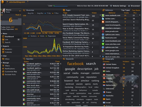
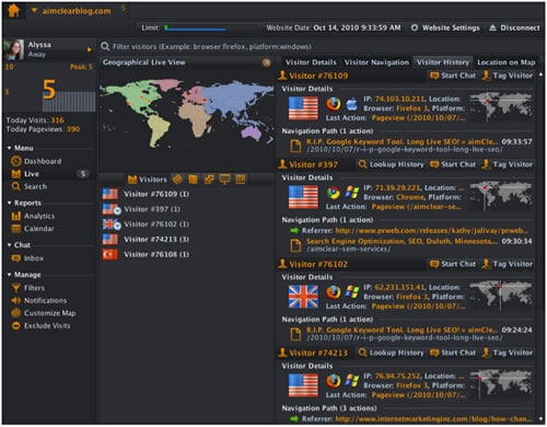
More analytics mavens are becoming aware of Woopra, a relatively inexpensive software package, available on the web and as a desktop application. Woopra is best known for its gorgeous daily dashboard (pictured above) and extremely useful real-time analytics features (below).  For this post, we’ll use the desktop application.
What’s less known are Woopra’s killer KPI reporting capabilities, using custom segmentation features Woopra calls “Filters.” This post extrapolates on my previous SearchEngineWatch article, “Google Analytics, Conversion Tracking & Single Segment Reporting Power,” bringing the powerful conversion tracking technique to Woopra, one of the most intuitive analytics UIs in the world.  Let’s get started building our KPI dashboard.
Creating KPI Segmentation “Filters” in Woopra
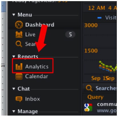
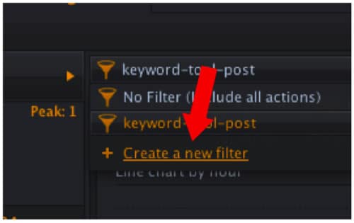
Start by clicking on the analytics link on the left-hand column.
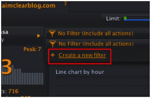
Then choose “Create a new filter.”
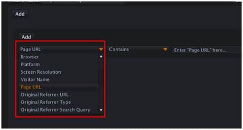
Choose from the standard suite of analytics segmenting criteria, including search query, platform, browser, full referral URL that includes any URL variables and referrer types, among others. Note that various engagement metrics are unique to Woopra, including an intriguing capacity to track segments flagging specific users you’ve tagged in the course of day-to-day real-time analysis.
For this demo we’ll track progress of our recent Google Keyword Tool article.
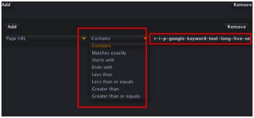
While we’ll keep this segment simple, note that it’s possible to stack complex segmenting criteria, just like when using Google Analytics Advanced Segments. After returning to the analytics link on the left-hand column, select the segment just created.
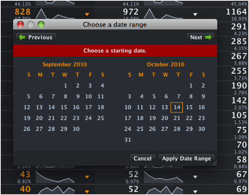
Then specify a date range. The link is in the UI’s upper right.
Great! Now we’re focusing all the power of Woopra analytics screens solely on our conversion segment. Our KPI, again, is traffic to a specific page.  This certainly could be a “Thank You” page with a confirmation URL variable for a form submission or an e-commerce purchase.  Actionable insights gained, whilst perusing single conversion segments, can be dramatic, colorful and super easy to read. Here are some reports we’re fond of.
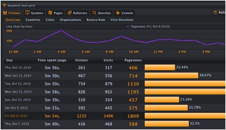
Conversion by Daily Visitors & Time On Page
This cool report highlights time-on-page each day that converting visitors invested in our content. Note that by clicking on Friday the 8th, the purple graph shows our page views for the selected day.
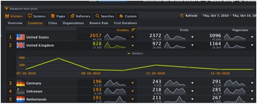
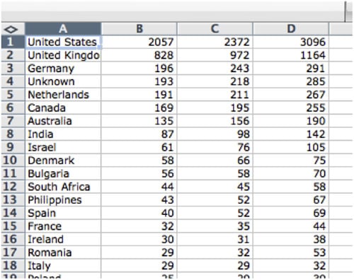
Conversion By Country
This über pretty report rarely fails to wow clients. Click on any line graph to expand the graph.
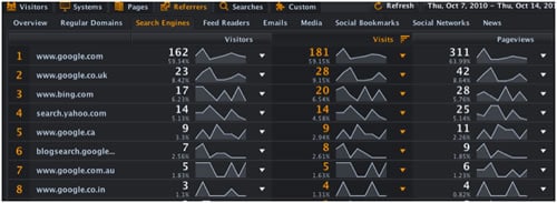
Search Engine Conversion
Wondering if keyword referrals from search engines around the world result in conversions? This report is crystal clear.
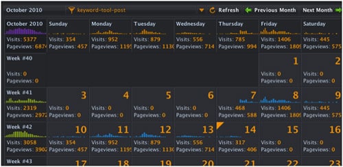
KPI Conversion Calendar
We love this one, and it’s truly one of the coolest features of Woopra. The upper left-hand corner shows KPI performance for month-to-date. Moving across the top row, we see conversion for the average Monday, Tuesday, Wednesday, etc. Then KPI success is tracked by the day for the rest of the month. This report kicks ass.
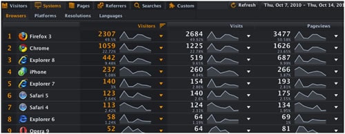
Conversion by Browser Type
Sometimes conversion problems are associated with issues sites have with certain browsers and platforms. Perhaps a key page in the funnel is not parsing correctly for some reason. This report flags conversion by browser.
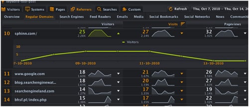
KPI Conversion by Referring Site
It’s easy to see that Sphinn.com has sent some visitors. We’ve clicked on Sphinn in the Woopra UI, graphing referrals to our KPI page by day. If a picture speaks a thousand words, this report offers 2000.
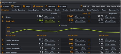
Conversion by Referral Type
Woopra has preset referral buckets, sorted by a basic subdivision of site-types that send traffic. The sort is by social networks, search engines, social bookmarks, feed readers, etc.
Exportable reports are uninspiring, but useful nonetheless.
Using Woopra as a KPI Dashboard
We suggest that those serious about reporting with Woopra build a macro that screen scrapes or otherwise documents reports for clients. It’s very cool to do a narrated screen cast and email the file to clients, giving a weekly 60-second overview of KPI progress from the previous week or other time interval. Also, clients can install their own local version on a computer to track KPI progress. It’s quite simple to teach anyone to choose between various KPI segments that we set up for them.
Enjoy, and let us know what you think of Woopra for KPI reporting.