
Want to blow people’s minds by quickly and efficiently pulling actionable insights from large spreadsheets? Look no further than PivotTables! The enigma of the Excel world, they are daunting for the uninitiated and invaluable for those in the know. Don’t get us wrong, we still <3 our formulas and complex dashboards, but for single-channel data and quick insights, PivotTables are where it’s at. Every time we discuss Excel hacks, it’s always about saving time. As marketers — and, let’s face it, as humans — there’s never enough time in the day to get everything done. PivotTables help us do more in less time, allowing us to focus on actual analysis, optimization or even just the simple pleasure of eating lunch away from our desks!
In this post, we’ll walk you through the process of creating and manipulating data using PivotTables. Where there are nuances between the PC and Mac versions of Excel, those differences are called out. Want to follow along and practice building a PivotTable? Open this sample data file in Excel to follow along and learn by doing! Ready? Here we go!

What is a PivotTable?
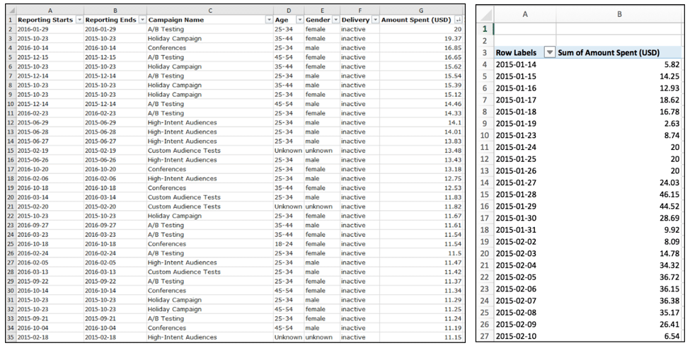
A PivotTable is a reporting tool that uses a spreadsheet, database or table to summarize data in columns and rows based on the options chosen by the user. For example, let’s say you have a massive report like the one provided and you want to quickly see spend day over day. Create a pivot report choosing date for the rows and spend for the values and boom! You have a quick DoD spend report.
A PivotTable consists of the following:
- PivotTable Fields – All of the column titles from the chosen data set
- Row Labels – The criteria the chosen metrics will be tied back to
- Values – The data that will be reported on
- Columns – Added information the data can be delineated by
- Filters – A way to parse out data by only what needs to be seen; filters of all criteria can be added and utilized to pare down the information shown
How to create a pivot report
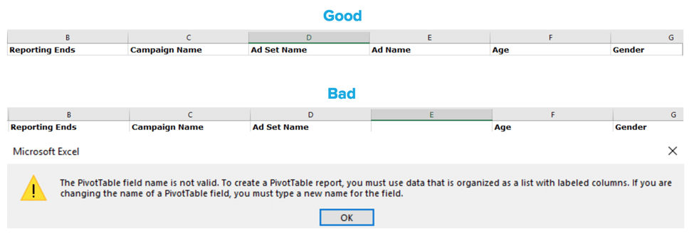
First, and most importantly, all data columns need to have a name in the top row for the PivotTable Fields to read.
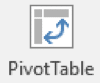
Highlight the data to pivot, go to the “Insert” tab on the toolbar (on the far left side in Excel 2016) and click the PivotTable button:
That will bring up this screen:
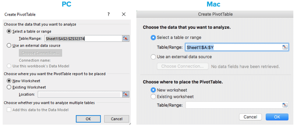
Note: A named data range can also be used to make it more obvious where the data is coming from. To do this, highlight the data and choose a name — no spaces — and input it in this box:
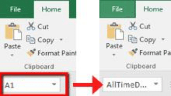
In this example, the data is named AllTimeData. Type this name into the Table/Range box and the PivotTable will read from that range. If this is a recurring report that will have data added periodically, you can choose the entire column (shown above in the Mac version). Highlight the entire column and over to the end of your data rather than only the portion with current data.
By default, the PivotTable will be created on a new tab. If you prefer to add it to an existing tab, choose the “Existing Worksheet” option and input the desired location. Once the data range and location have been chosen, hit “OK” and the PivotTable Fields menu will show up in the desired location along the right side of the screen:
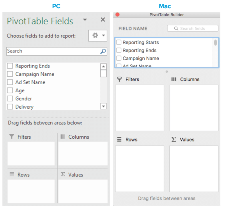
Now it’s time to play! While working with the PivotTable Fields menu, keep the following in mind:
- Clicking on the checkbox next to the field names will automatically place them in the Rows section for non-numeric fields and in the Values section for numeric fields.
- The fields added to the Values section will automatically Sum if all of the cells in the chosen Field data have values. If there are blanks in the column of the chosen data set, they will automatically Count.
- If desired, fields can be added by dragging and dropping (they can be reorganized this way as well). The Filter and Columns areas need to be dragged and dropped into.
- If a non-numeric field is added to the Values section, it will automatically count the total number of occurrences (all occurrences, not unique occurrences) for each Row criteria.
- All column headings will be named with the Field name and “Sum of,” “Count of,” etc. The headings can be renamed but cannot be named a name that already exists. The workaround is to add a space after the new header name to make it “different” than the original header.
- Once the PivotTable Fields menu has been closed, reopening it is as easy as right clicking anywhere in the PivotTable and choosing “Show Field List.” On a Mac, click into the PivotTable and click “Field List” on the toolbar.
For the DoD view shown above, we placed “Reporting Ends” in the Rows area and “Amount Spent” in the Values area. If you want to see spend DoD split out by campaign, pull “Campaign Name” into the Columns area and it will segment it out in the columns.
A couple handy tips:
- Because the data is so easily parsed, exporting as much data as possible — think Campaign, Ad Set, Ads/Keywords, by demographic or device, by day, and all time — is the best way to avoid double work. Once the pivoting starts, it’s easy to find something else interesting to segment by, and if everything is already in the raw data, there’s no need to go back to the UI for more.
- If any changes are made to the raw data, the report can be refreshed. Right click anywhere in the table and click “Refresh.” If the changes made were to column names that are currently in use, they will need to be pulled in again after the refresh.
There’s more fun stuff??
Pro tips:
Calculated Fields!
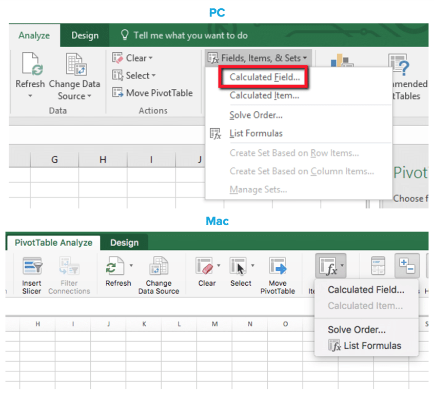
Never, ever, ever, ever, ever, ever* average an average, percent or calculation out of the raw data. For metrics such as CPC, CTR and the like, calculate those from scratch using the Calculated Fields option. Click anywhere in the PivotTable, and the Analyze and Design tabs will show up in the top toolbar on the right. In the Analyze tab (PivotTable Analyze on Mac), click the “Fields, Items, & Sets” dropdown then the “Calculated Field” option:
Once clicked, this box will open:
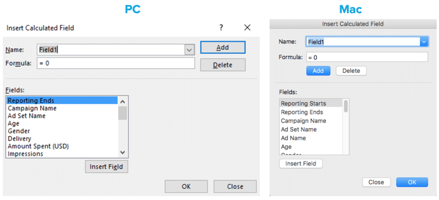
Name the Calculated Field. As stated above, the names cannot be duplicates of a Field that already exists. A space before or after a duplicated Field name will get around that issue. Next, choose the Fields to be calculated and click “Insert Field.” The options will be placed in the Formula box:
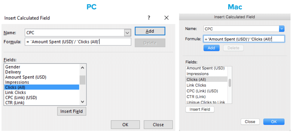
Using the dropdown in the Name box will allow all Calculated Fields to be viewed and edited. Some notes:
- The Calculated Field will always show with the “Sum of Name” header.
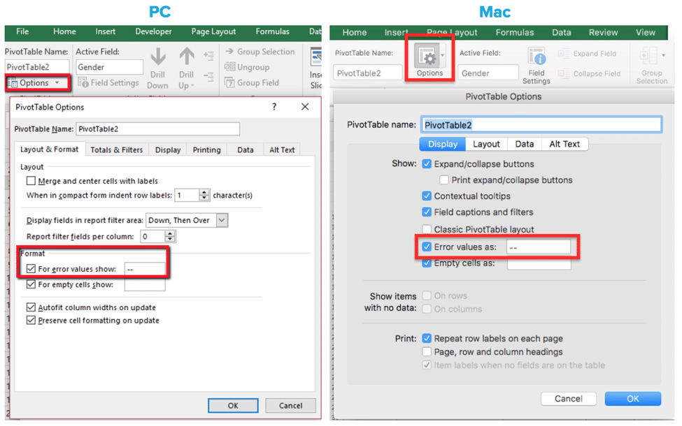
- Errors such as #N/A or #DIV/0! tend to make important information difficult to read. You can format errors in the Analyze tab. Once in the tab, click on the “Options” button on the left side. Then in the “Layout & Format” tab under Format is an option to choose what is shown for error values. An easy one is to simply use two dashes (“–“):
*OK, one caveat to the “never, ever, ever, ever, ever, ever average an average” comment: Some metrics such as Bounce Rate and Average Position can’t be calculated so must, regrettably, be averaged with the understanding that it’s not going to be factually accurate, but should give directional accuracy.
Formatting
As with normal cells, right clicking gives options to format cells. Clicking on the header and choosing from either “Format Cells” or “Number Format” (Number Format only on PC) will allow the entire column to be formatted in the chosen manner.
There are multiple ways to represent the information within a PivotTable. Right clicking on either the header cell or clicking on the dropdown in the value fields in the Field List and choosing “Value Field Settings” (simply right click on a Mac and select “Field Settings”) will open this options box:
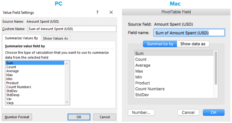
(Number Format can also be chosen in this option box as well.) The “Show Values As” option (“Show data as” on a Mac) also gives additional value options:
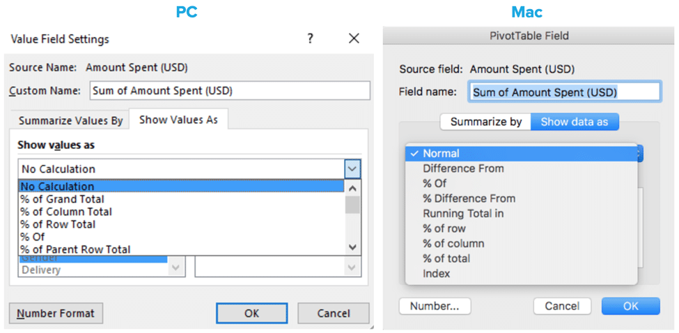
The default is “No Calculation” (“Normal” on a Mac). This simply means that the values will default to the option chosen in the “Summarize Values By” area. The other options give additional ways to view the data. Play around to ensure understanding of all the options available (there are 15, so we’re not going to explain each one here!).
Speaking of formatting, there’s a whole Design tab that can be used to format the PivotTable to make it more pretty, understandable, etc.:
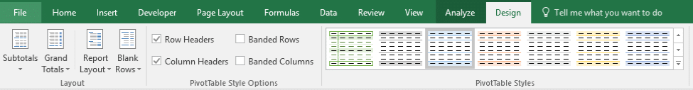
There are color options, different options for displaying the row labels, what kind of subtotals are wanted and where to display them — so many options!
Filtering
A really awesome feature for narrowing down information is the Filter option. Drag any of the fields into this area and a filter box will show up at the top of the PivotTable:
For this example we want to be able to filter by delivery:
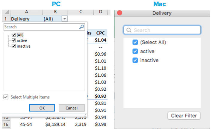
Once a delivery option is chosen, the data in the table will only reflect the information we want to see (multiple filters can be applied).
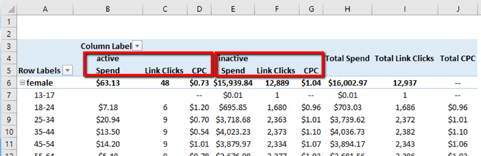
The columns option is another way to break down the data for even more granularity. As soon as Fields are added to the Values section, Values are automatically put in the Columns section. From there, additional options can be added. For example, instead of filtering by delivery, we can view it side-by-side (admittedly, the formatting isn’t awesome; some merge & center action usually happens when we use this):
Examples
Alright, alright. You’ve got the basics down. Now how can you put this into play as a marketer? Here’s a couple examples.
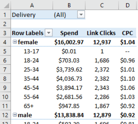
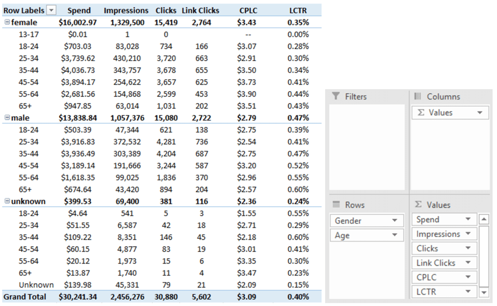
Periodically we’ll take a look at our demographics to ensure we’re marketing to the correct audiences. A quick pivot can deliver actionable insights in minutes:
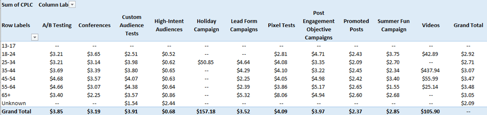
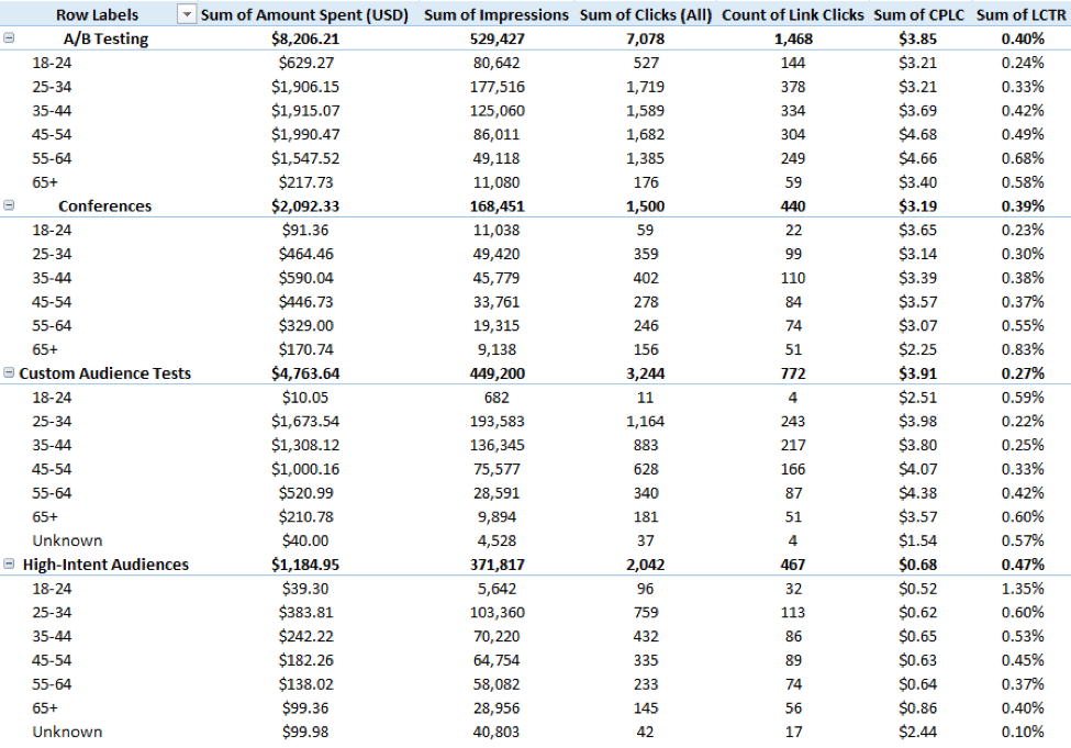
It’s also a good idea to see how demographics affect cost across campaigns. Depending on the depth of data you want to look at and how you like to visualize, there are many ways to pivot out that information:
Another big one to look at on a regular basis is a day of week/hour of day review. This will show you the most cost efficient times to be active and can help save money:
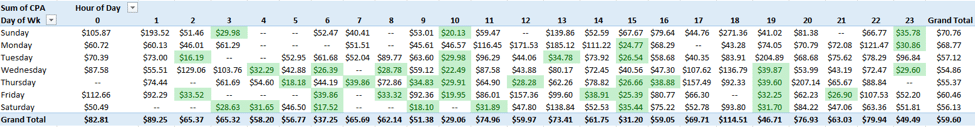
Add some conditional formatting to highlight the days and times that are lower than your goal, and you can start to pick out patterns and optimize towards those efficient times.

Yay!! Truly, with even a rudimentary knowledge of the power of PivotTables, it’s amazing how much time can be saved. The less time spent dissecting the data, the more time you have to utilize the information uncovered and actually effect change and improvements, which is good news for us all!