
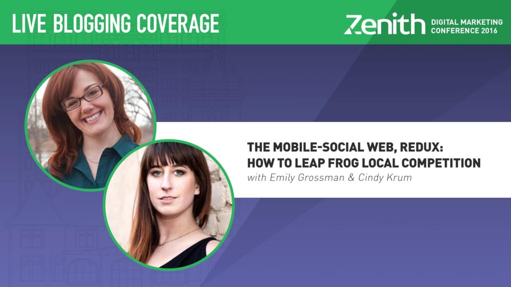
Leap frog! We’re hopping into the mobile, social sweet spot with MobileMoxie’s dynamic duo, CEO Cindy Krum and Mobile Marketing Specialist Emily Grossman.
After a stunning morning keynote, Cindy transitioned from the wild world of artificial intelligence into all-things-mobile. From Mobilegeddon to the science behind app results in mobile, Cindy and Emily gave the Zenith crowd plenty to think about — now and down the road.
Mobile Mania
April 21. Mobilegeddon. Remember this? It was the Google deadline for getting your site mobile-friendly. It was perceived as a BIG deal and SEOs around the world were freaked out… Turns out it was a big deal. Having a mobile-friendly website is important — not only for users, but for Google ranking factors as well (particularly for small businesses).
The fun isn’t over yet. Another update is on the way! In May, Google is zeroing in on mobile-friendly ranking factors. If you’re not mobile-friendly, now’s the time to double down and get serious.
How do you know if you’re mobile-friendly? Pull out your mobile phone and do a site colon search for your site. You’ll get a long list and can check to see if your site’s major pages are getting a mobile-friendly stamp of approval. There’s no middle ground here. You either have the tag or you don’t. You can do it for your competitors too… (if they don’t have the mobile-friendly tag, leap frog that biz).
Mobile Site Architecture
Style Sheets. It’s important to remember: Google is trying to emulate the mobile user experience. So, it has to see your style sheets and java script. People used to hide them to keep from wasting bots’ time. But now, it’s necessary to get that sought after mobile-friendly tag. So, open that up to the bots. They need it.
Tools. Want to pinpoint and understand the areas your mobile site is falling short? Google Search Consult is a helpful tool that will assess your mobile site and highlight issues that may keep you from attaining mobile-friendly status.
Want to see what the bot is getting? Be the bot! Use the mobile-friendly fetch and render tool to see your mobile site AS the bot sees you. It’s like a bot mirror… sort of.
View port. It’s all about rendering your mobile page for the appropriate mobile sizes. Have a broken view port? The mobile experience gets weird… and small, causing people to scroll around to get the content they’re seeking. In short, it creates a frustrating user experience.
Turn off flash. Have flash? It doesn’t work on phones.
Page speed. Google cares! If your mobile pages are too slow, you likely won’t get that mobile-friendly tag. Cindy predicts Google will soon double down on page speed, so evaluate! You can do so with the Google PageSpeed Test, which will give you mobile and desktop speeds and plenty of feedback. Cindy said to ignore the scores, because they can totally hurt your feelings.
“Don’t live and die by the scores, but do live and die by the actual feedback it gives you,” Cindy said.
Other tools include Webmaster tools, Google Analytics and WebPageTest.org (Cindy’s favorite). YSLOW is another one which includes a site and plugin. URIValet.com is great for looking at issues with images. Speaking of images…
Images Matter
Sprites! Not the drink. Image sprites allow you to load a lot of images all at once — individual requests to the server for each image slows down mobile load time. Cindy advised to sprite it up and use style sheets to place images on the page. Your load time will thank you. Other tips: Check file size and responsiveness.
AMP
AMP: Accelerated Mobile Pages Project. If you have a blog, AMP is key for mobile optimization, as it allows you to rank on the top of the search carousel (plus you get a lightning bolt). Have you seen the lighting bolt? It tells the user it’s going to load really, really fast. It’s a great sign (literally). All the big publishers are using it. Good news: It comes ready to go with WordPress.
Thanks for blowing our minds, Cindy!
Now on to Emily’s portion of the show
How Apps Are Impacting Local Search Results
- People are spending more time on social media apps than desktop platforms in general. Google is also starting to send people to apps from search results. This hit the scene in the last year and not all devices are reacting equally. Results vary from device, OS and location. If you care about particular devices, users or regions, it’s useful to put your queries through a social search simulator.
- Emily advises NOT to ignore the power of deep links. Your competitors could be benefiting from this. Take a look (do a mobile search). It’s not just about your particular URL, it’s also about how you’re competing with deep links. This can come about in unexpected ways. A lot of seemingly small actions on social media are impacting mobile results! Even a Pinterest post with a relevant hashtag can allow you to show up on mobile! Bam, business.
- How is social media different on mobile apps and websites? The user experience on social media apps is different than the experience on social media websites. Be cognizant of that. Emily advises that if you’re hardcore into social media, you should pay attention.
- Think of the mobile Facebook app experience. If you’re on an iOS device and click on a link through mobile Facebook, for example, it takes you into a Facebook browser experience. This is great for Facebook, but tricky for users who want to share the content they’ve discovered. If you don’t test your site on the app before publishing, it could lead to trouble… and users are quick to expose any issues you’ve caused them.
Gettin’ Local
“If you walk away with no other tip today, get a Facebook beacon.” – Emily
What’s a beacon? Small businesses, pay attention! They’re free and allow you to communicate with people near your business through your Facebook app. That’s exciting — and easy. You’re able to passively target customers near you who might want in on what you’re all about.
Encouraging your customers to check in through their Facebook app is also important for mobile strategy as it allows you to connect with that same qualified customer in the future.
Quick tip time!
Make sure that when someone uses voice to call your business, it actually calls your business (and not your competitors, for example). Also, check how your brand is ranking through Google Now on Tap. It makes it a whole lot easier for customers to quickly and conveniently connect with you.
Woah! That was amazing, Cindy and Emily. You two gave us plenty to absorb. Thank you 🙂


