“Your baby is ugly.” What an endearing way to kick-off a presentation, right? Tim Ash’s session Seven Deadly Sins of Landing Page Design Optimization: The Definition guide to Testing and Tuning Conversions at eMetrics Canada 2010 had the audience engaged from start to finish and well into post-delivery.
So what did he mean when he referred to your baby as an “ugly, ugly little misshapen munchkin?” And how did these claims that “every parent is delusional, viewing their baby as beautiful” translate to landing page optimization? The point was: we all have the same biased, rose-colored view of our web marketing program. Tim is here to advise against this unrealistic view.
 Most of the time we feel like we’re rolling out the red carpet for our customers every time they visit our site. To us, our desired call-to-action couldn’t be any clearer. But this could not be farther from the truth. Ninety-nine percent of potential customers view of our online marketing as a castle wall they have to scale with their bare hands. The worst part is that we built that wall, brick by brick, and are damn proud of it. While a very small percentage of people have already decided they will meet their needs with your site- Â are willing to hurdle any barrier to get what they came for- you must consider the mindset of the majority of visitors. (At this point Tim has the audience testify, “I AM A SINNER!”) Now let’s see where we fall short:
Sin #1 – An Unclear Call-to-Action
The only people that matter are your website visitors. If visitors come to a page on your site and feel uncertain as to what they are supposed to do next, this is a problem. Repent! The desired call-to-action needs to be blatantly- even painfully- obvious, otherwise you’re losing money. (This is the ‘”obvious standard,” aka “mother-in-law test.”)
Sin #2 – Giving Too Many Choices
Tim pulls up a landing page with 146 clickable links. Holy overabundance of options, Batman! This is a common occurrence with catalog sites. Next he shows the B&H homepage, showcasing the power of creating product categories. The human eye 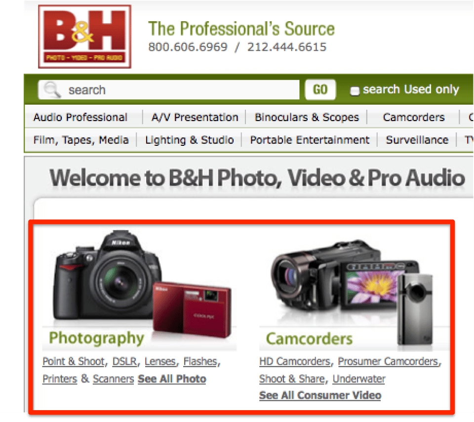 reads letter by letter, but on the other hand, we process visual information 4-500 times faster than actual words. This is one for the books: the purpose of the homepage is to get people off the homepage. It’s a simple traffic directory, nothing more.
“The 3 click rule is bullshit.” The 3 click rule argues that a user should be able to find any information they need in no more than three clicks from the landing page. Do not orchestrate your design based on this flawed concept! What you should focus on is Information Forging Theory. This field of study suggests that so long as the user feels they’re taking a logical steps towards their end goal, they will stay in the funnel.
Sin #3 Asking for Too Much Info Too Soon
This is a very common mistake. Imagine walking into a store only to be greeted by a salesperson greeting you with an abrasive:Â “Welcome to our store! Would you like me to hold your credit card while you shop?” Not comforting. Run a form field test on yourself. Is the information absolutely necessary to complete the current transaction? If not, you don’t need it.
Sin #4 – Too Much Text
If you want users to completely bypass your text content without a second thought, write in complete sentences and use as few line breaks as possible. Works every time! Remember that nobody cares as much as you.
Tips:
- Write in newspaper style (headlines, bullet points, tell the what, why, where and how upfront)
- Strike out every adjective on the page
- Take out every unsubstantiated claim
Sin #5 – Not Keeping Your Promises
When visitors show up on your landing page, keep in mind they came from somewhere. Maybe it was a tweet, a Facebook status update or a PPC ad. Whatever the exit, there is an appreciable level of expectation involved. Every context sets an expectation. Meet (nay, exceed!) this opportunity. Don’t let them down by over-promising and under-delivering.
Sin #6 – Visual Distractions
What do you want people to look at first? If this is not obvious, you’re losing potential customers. Functional pages that make the cash register go “ca-ching” are not so pretty outside of the box form designs. To drive sales you need to stick with the form that works.
Sin #7 – Lack of Trust
Ultimately, you need to be able to answer this question: “How do I create instant trust online?” Understand that there is a trust deficit to overcome. Don’t undermine the potential and opportunity to gain your visitors’ trust, and don’t be afraid to show trust symbols above the fold- right in the user’s line of sight.
At the end of the day it is imperative to take off your rose-colored glasses, roll up your sleeves and get to work.